How to map an operating model
Your operating model is a delivery system. Its job is to serve and create the customer experience.
Most aren't designed that way. They're built around functions and reporting lines, with the customer added in afterwards. Understanding how your organisation needs to be shaped around delivery is the starting point. And that means making the end-to-end system visible.
This post covers the mapping itself. It's one part of a wider end-to-end operating model method I’ve developed. Mapping an operating model requires working out what the system actually is, what it needs to be, and finding a way to communicate it clearly.
If individual journeys, products, and services are already mapped, those will give you a head start. If you don't have them, that's not a show stopper. What matters is a working understanding of the customer journeys and the operation beneath them, even if none of it is formally documented yet.
Gather your evidence before you start
Pull together what exists across user research, customer data, financial reporting, and performance. Talk to the people who actually speak to customers and run the operation, not just the ones who manage it. The people closest to the work usually know exactly where it breaks down.
This isn't a solo exercise. The map is more accurate and more useful when it's built with people who know the organisation, not presented to them afterwards. The act of mapping together, the disagreements, the reframing, the decisions made in the room, is often as valuable as the artefact itself.
Step 1: Start with products and services
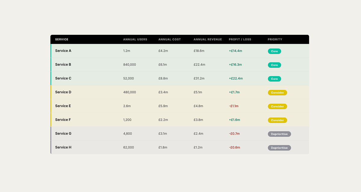
Most organisations think in terms of programmes, BAU, and workstreams. Reframe that. What are the things being delivered and run continuously for customers? Ideally these would be products and services, but your organisation might not be there yet.
Wherever they’re at, list what your organisation delivers. Add commercial analysis, considering what's most valuable, most used, most strategically important.
This gives you two lenses you'll hold throughout. For the as-is, what's dominant in the delivery system right now? For the to-be, what's most valuable, and what should the delivery system be organised around? These lenses shape every decision you make as you map, both what you include and how you draw it.
Start with the priorities. Knowing how to prioritise across your products and services is worth doing carefully before you go further.
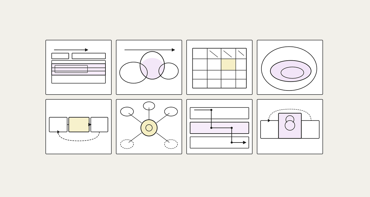
Step 2: Sketch quickly, multiple times
Don't go straight to a polished diagram. Do quick sketches, as many interpretations as you can. No right or wrong. A slow crazy-8 format works well. Draw parts, don’t worry about joining up the whole thing yet.
Each sketch is helping you test what the system actually is and whether you can communicate it clearly. Some interpretations will feel accurate but won't communicate. Others will look clean but won't be honest. You're looking for how to do both.
Step 3: Place the customer journey at the top
Set up customer journey stages along the top as a horizontal axis. These are the major phases a customer moves through, not a detailed journey map.
Everything else hangs off these stages. Once you've placed the customer at the top, every part of the organisation has to answer the same question: What are we doing to serve our customers? That question applies equally to the content of the map and to how you draw it.
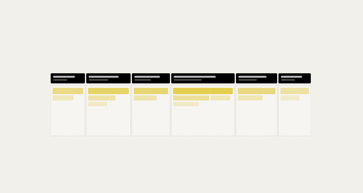
Step 4: Build the front stage
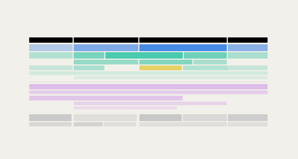
Map what customers directly experience at each stage, showing the products, services, and touchpoints they interact with. Place each against the relevant customer journey stage. If you already have service maps, this is where they feed in.
The test for the as-is is accuracy, does this reflect how the organisation actually works? The test for the visual is clarity, can someone understand this without you explaining it?
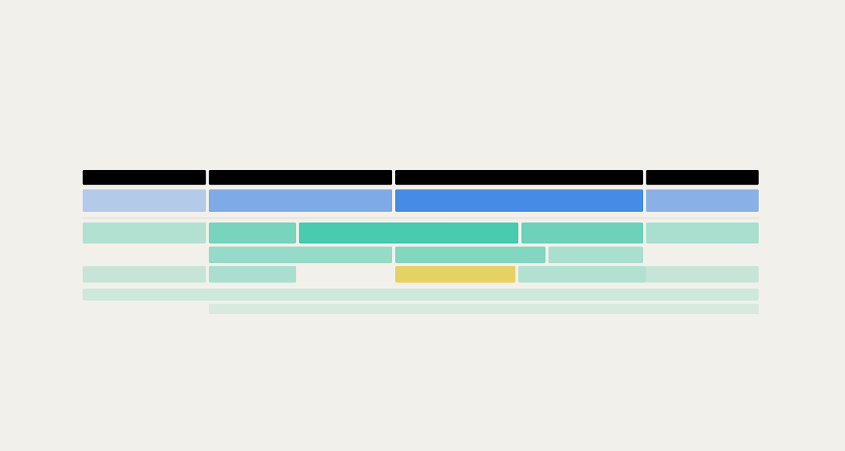
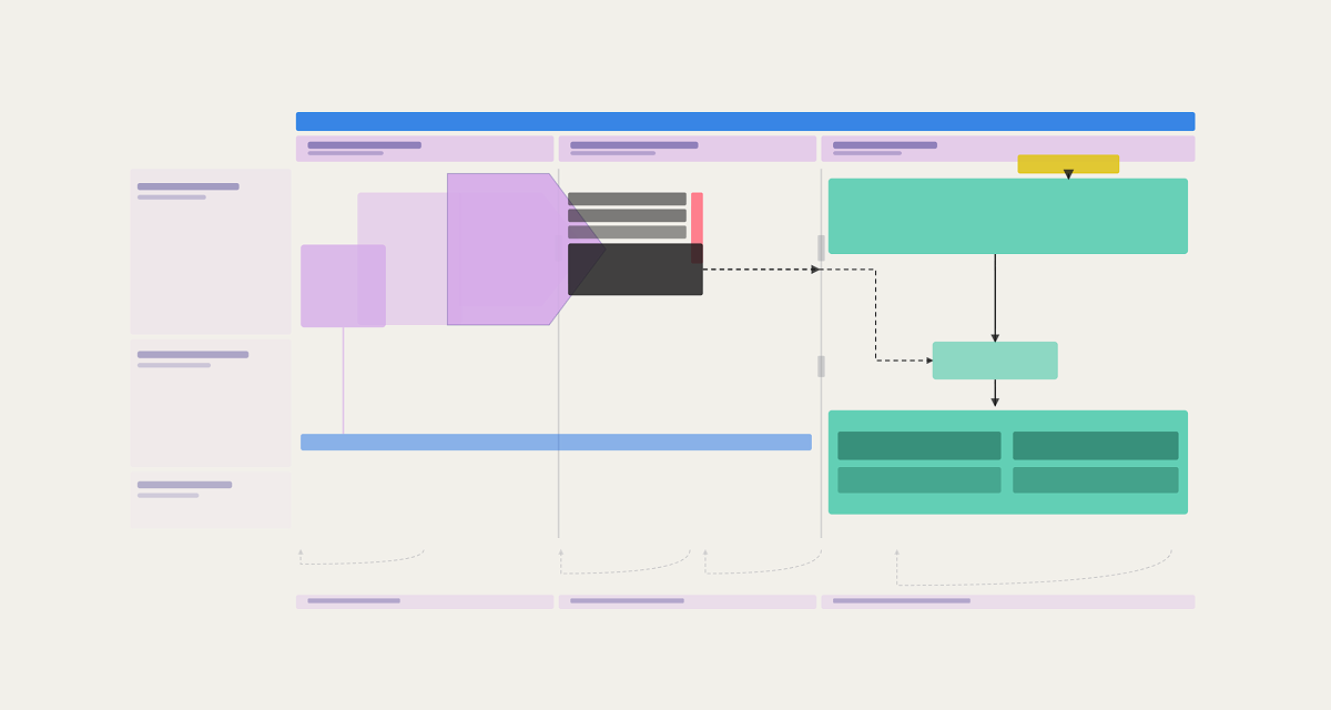
Step 5: Map the enabling system
Behind every front stage product or service is the back stage that makes it work. These are the internal products and services, platforms, capabilities, and data that power delivery. This is the layer most organisations have the least clarity on, and where the biggest efficiency and coherence gains usually live.
For each product or service ask: What has to exist behind this to make it work reliably at scale? Then ask whether each enabling element should be repeatable across the whole organisation, common across some products and services, or independent to a specific part of the operation. That distinction matters commercially. Shared systems that were never designed to be shared don’t support delivery effectively. While systems that are duplicative create inefficiency.
The shape of the enabling system should follow the shape of the delivery model. If the two are misaligned, that's usually where the friction and cost are hiding.
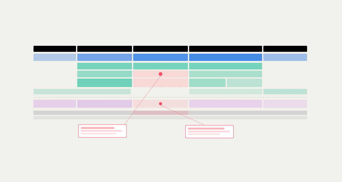
Step 6: Look for where the flow breaks
With the layers in place, read the map. Where does information fail to travel? Where do decisions land in the wrong place? Where does the customer feel a break in the journey?
The places where a customer's experience degrades almost always map back to where the system isn’t working. Find those moments and trace them back. Then work out how to make that visible on the map.
Step 7: Draft and iterate
Bring the best parts of your rough sketches together into a working draft. Show it to people who know the organisation. Every time someone says "that's not quite right" you've learned something about how it actually works. Every organisation has patterns that surprise you when you see them from the outside.
Once the content is stable, refine the visual language. Strip out anything too detailed or not important enough. Visual communication changes how people think. A map that doesn't tell a story won't change anything.
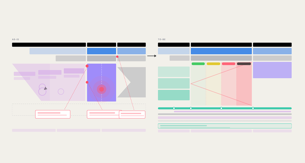
Mapping the to-be
The as-is tells you what you're dealing with. The to-be is what you take to a leadership team. Designing how the organisation delivers for customers means making that shift deliberately.
Before you sketch, go back to your evidence. Start with the organisation's strategy. What is it trying to achieve, and how will it benefit customers and the business? The to-be operating model only makes sense in relation to that. Your data and research tell you where the biggest gaps are between the current customer experience and what the strategy needs it to do. Your commercial analysis tells you what's most valuable and therefore what the to-be should be organised around.
Sketch again. Same process, but now you're holding two questions. Does this accurately reflect what the organisation needs to become, based on the evidence? And does the visual make that argument clearly enough to land with a leadership team? A to-be that's right but unreadable won't move anyone. A to-be that looks clean but isn't grounded in the data won't survive scrutiny.
Look for structural changes that resolve multiple problems at once. Bring the most important elements together using the same layered structure as the as-is. Keep iterating until the model fixes the problems, realises the opportunities, and prioritises the right value. Then refine the visual language the same way.
When you put the as-is and to-be side by side, the gap between them shows what needs to change. The to-be isn't a target to execute against. It's a flag in the sand, a direction to head towards, to iterate as you learn. The next step is to prioritise and decide where to start.
A note on the visual system mapping
Mapping at this level requires two things: the ability to think in systems, and the ability to communicate that visually, showing flow, hierarchy, and connections clearly and simply. Both skills develop with practice, but they also come more naturally to some people than others. If you struggle to represent systems in a way that's clear and visual, that's not a gap training alone will close. Some of it is aptitude. The method and templates give you a structure to work from, but the visual judgement and end-to-end thinking is something you either develop through practice or you bring in someone who already has it.
This method covers the mapping of the delivery and enabling systems. Governance, teams, skills, and accountability are equally important. But they should follow on from understanding the system, not precede it.
Interested in learning how to do this?
I'm developing a practical full-day training session on operating model mapping. You'll work on your own organisation throughout the day, leaving with a draft map and the confidence to do organisation-wide system mapping collaboratively.
Fill in the short form below to be first to hear about it and share what would be useful for you:
Register your interest